The New Logo for Income-Outcome

Published Date
A New Logo for Income|Outcome—With the Same Powerful Learning Principles
We are slowly transitioning from our old logo (left) to a new one (right).
You’ll notice certain similarities—the blue and green colors, which are prominent in our game boards and pieces, and the I and O with a slash between them.
But the biggest visual shift is the change from a round, fluid design to a square, blocky structure.
Why the Change?
Originally, the circular feel of the old logo represented money moving down the Receivables track into the Green Cash circle. That was a nice concept, but we have since redesigned the board, flipping the Income Statement and Balance Sheet and adjusting colors—so it made sense for the logo to evolve as well.
The Practical Benefit of the New Logo
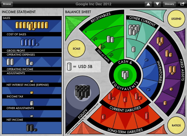
Now, when we introduce the game board, we draw a rectangle on a flip chart or whiteboard and make a vertical slash through it:
- “This on the left is the Income Statement, and this—centered on the Cash Circle—is the Balance Sheet.”
This simple, visual introduction immediately clarifies the structure of financial statements for participants.
Expanding Financial Learning: Videos & More
We have a series of little videos being produced for our facilitators, demonstrating how the Income|Outcome game board itself can be used to teach fundamental accounting concepts, including:
- Key ratios
- Cost structure
- Leverage
- Managing for profit vs. managing for cash flow
These same visual finance principles are embedded in both the game board and the Visual Finance app.
Reinforcing Learning Through the Logo
At the end of the workshop, we reinforce the key takeaways:
- Sales flow down through Costs and Expenses, leaving Net Income at the bottom—this structure is mirrored on the Income Statement side of the logo.
- The Balance Sheet captures the Outcome of all business activities, with Cash at the center—just as in our game.
For those who haven’t played the game, the logo might seem abstract. But for everyone who experiences an Income|Outcome workshop, the new logo will trigger and reinforce the key insights they developed.
A Legacy of Clear Financial Representation
The clarity of our 1996 board design continues to deliver new benefits. It remains the cleanest, clearest, and simplest illustration of financial statements anywhere.
For that, we owe thanks to Eliza, who insisted that the board had to:
- Include everything that appears in financial statements
- Exclude anything that isn’t a financial statement line item
- Structure items to reflect the layout of real financial statements
The new logo is simply another evolution of that original drive—and it is incredibly useful.

