Visual Finance: Reading the Company Board® for Google

Published Date
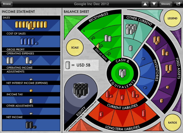
The Company Board® is a graphical presentation of a company’s financial results that transforms rows of numbers into an intuitive visual display. By representing individual line items from the Income Statement and Balance Sheet as colored stacks—with a scale shown at the center—it becomes easy to grasp key financial relationships at a glance.
How the Company Board® Works
Income Statement (Left Side):
- Gold Stacks:
Represent money coming into the business (Sales Revenue and, at times, additional Adjustments). - Blue Stacks:
Depict the direct Cost of Revenue (COGS or COS). - Silver Stacks:
Show other Expenses, including SG&A, R&D, and Taxes. - Black Stacks:
Represent Net Income (Profit) at the bottom, or shadow stacks if there is a Loss.
Balance Sheet (Right Side):
- Silver Stacks:
Illustrate Cash, Receivables, and other non-inventory Current Assets. Receivables are automatically adjusted based on Days Sales Outstanding. - Blue Stacks:
Represent the value of Inventories, shown along the blue arc. Together with the silver stacks, they form the Current Assets. - Copper Stacks:
Indicate Fixed Assets.
The combined value of these silver, blue, and copper stacks equals Total Assets—which, in turn, is balanced by Liabilities and Equity:
- Red Stacks:
Represent Short-Term Debt (Current Liabilities) and Long-Term Debt, with those nearer to the Cash area indicating liabilities due within the year. - Black Stacks (on the Balance Sheet Corner):
Represent Equity.
A Visual Snapshot: Google’s 2012 Results
The Company Board® offers a rapid, visual assessment of a company’s health and strategic priorities. For example, consider Google’s 2012 annual report:
- Profitability:
The Income Statement side shows a bottom line (Net Income) represented by 2 stacks, compared to 10 stacks for Sales Revenue. This visually communicates a Return On Sales of roughly 20% (with exact numbers available via on-board ratios). - Debt vs. Equity:
While a debt figure of $22 billion might sound substantial, the visualization places the red Liabilities stacks next to the black Equity stacks, clearly demonstrating that the debt is comparatively minor—and appropriate.
Additional insights from the graphic include:
- Google earns more from its cash and investments than it spends on Interest expense (indicated by the finance line in gold, not silver).
- The significant Goodwill on the Balance Sheet reflects Google’s aggressive growth-through-acquisition strategy.
Why the Company Board® Matters
The Company Board® doesn’t just make financial data more accessible—it prioritizes information so that you can quickly assess a company’s overall health and identify key areas of strategic concern. This powerful tool is an essential component of our business acumen workshops at Andromeda Simulations International, where we help professionals connect the lessons learned during simulations to the realities of real-world companies.
Even if you haven’t participated in an Income|Outcome® business simulation, the Company Board® is invaluable. It offers a fresh perspective on financial statements, moving beyond columns of numbers to reveal the underlying web of ratios and relationships that define a company’s performance.
Explore Visual Finance
To complement the Company Board® and enhance your financial analysis, we offer Visual Finance—our innovative web app that brings these visualizations to life. Unlike the original iPad version, Visual Finance is now accessible from any device at visualfinanceweb.com.
Or you can book a call for a demo of our business acumen simulations and the Visual Finance app and how they work together.

